CNP
Redefining the strength
conditioning brand.
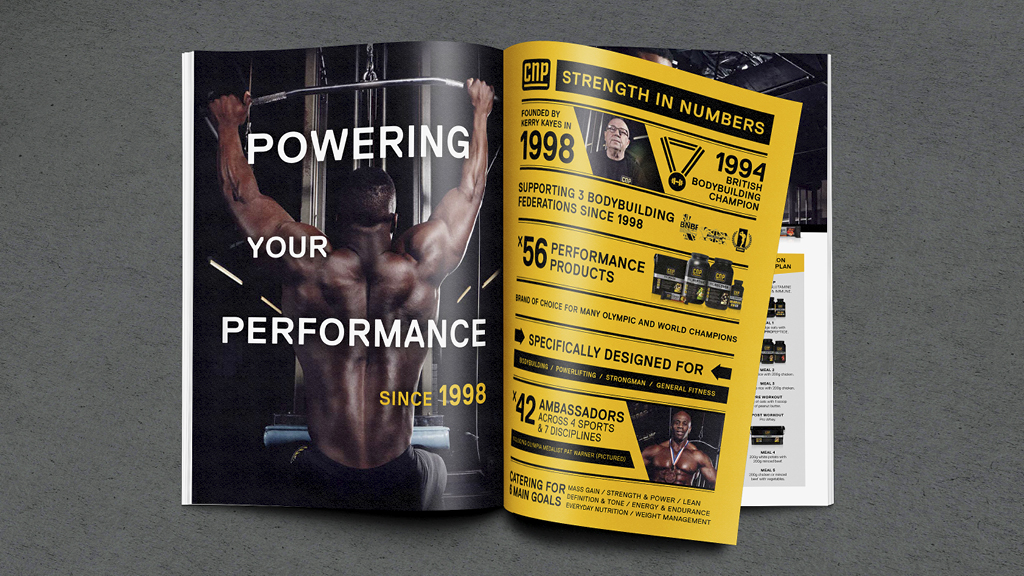
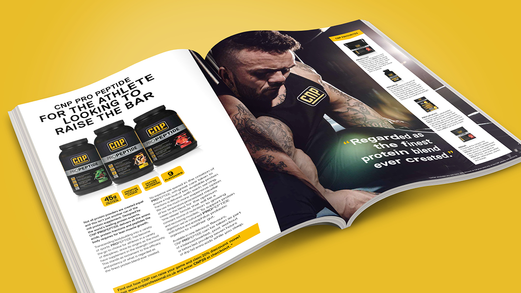
CNP Professional tasked Truth with re-launching its visual language to support business strategies in regaining its status as the go-to product range for professional athletes within the UK sports nutrition market.
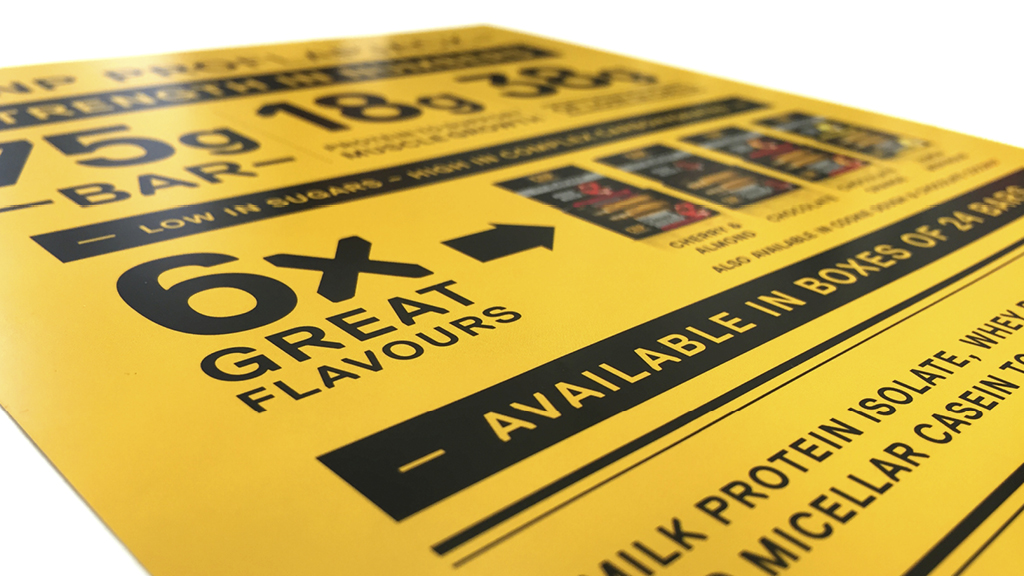
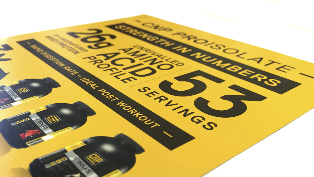
Work has involved modernising the brand mark to elevate the company’s visual position; subtly crafting the typography so that the lettering is consistently constructed and its distinctive details work on a small scale. Finally, adjusting the colour palette to black on a richer yellow achieves a greater visual standout.
"Our approach to redefining CNP’s visual identity has seen us draw on its core heritage of bodybuilding, strength and conditioning, whilst also seeking to engage the mainstream market.
This includes the female gym-going audience and non-professionals striving to improve physique. We are now focused on communicating this new look and style with an integrated brand campaign.
Darren Scott -Creative Director
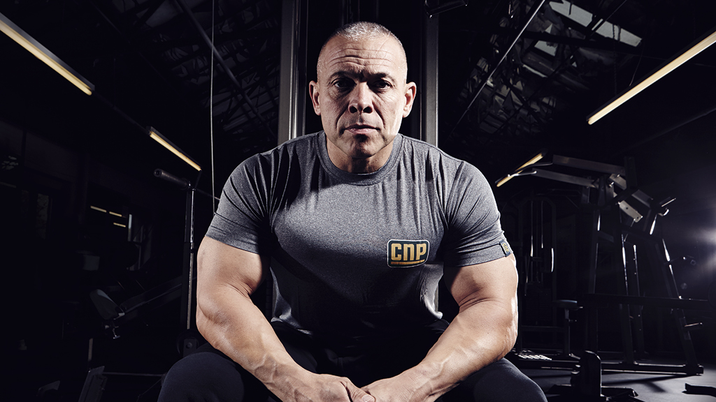
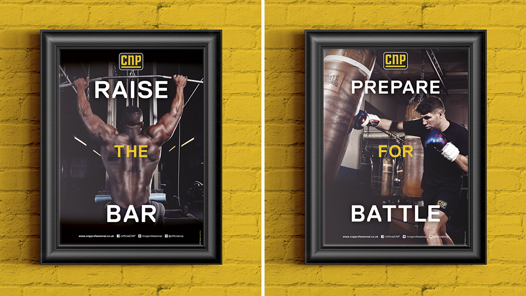
Beyond the brand mark, Truth has modified CNP’s tone of voice and imagery to provide a more natural, atmospheric style that reflects the supreme performance and determination of the athlete.
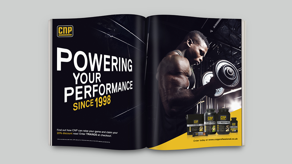
The new visual identity will now be executed by Truth in an integrated brand awareness campaign that includes a new website, advertising, exhibitions, content marketing and new sales support collateral.

